Your assignment
Create and test a mobile comparison-page prototype. Use your own project, or practice with the clearly illustrative compact-desk-lamp scenario.
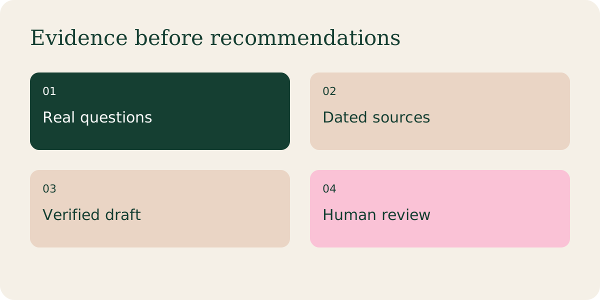
Step by step
Give Claude Design or Figma a content brief with real headings, evidence, disclosure, comparison criteria and one primary action. Ask for two layouts, not a finished factual product review.
Use Figma to refine typography, reusable cards, spacing and responsive behavior. Figma Make can help produce an interactive prototype; review generated behavior before treating it as production software.
Design small screens first. Keep affiliate disclosure readable, distinguish editorial recommendations from ads and make links describe their destination.
Ask AI for an accessibility and clarity review, then test keyboard navigation, contrast, headings and zoom manually. Simulated persona feedback is a hypothesis, not usability research.
Give real participants a task: “Find an option for a small desk and explain its main drawback.” Watch without coaching them. Note errors and confusion, revise, then test again. Ask permission before recording.
Try this prompt
Replace bracketed inputs with your real notes. Keep sensitive information out.
Design a mobile-first comparison page from this approved copy [copy]. Include the disclosure, criteria, evidence labels, drawbacks and a clear merchant link. Create two layout options. Specify keyboard focus, readable type and narrow-screen behavior. Do not invent ratings or endorsements.
A worked example
Illustrative UX finding: readers miss a limitation hidden below the button. Move the limitation into each product card and retest comprehension.